Data Visualisation in R
By Cathy Lordan, PhD (Teagasc, Fermoy, Co. Cork, Ireland)
Translating data into appealing and informative graphical representations is not an easy task. It requires much deliberation over the appropriate graph type and hours of agonising over the right colour palette. Beyond the aesthetics, graphical representation of your data is incredibly important for research publication and/or oral and poster presentations. It conveys the message of your data in a succinct and understandable way; indeed, it is the storyteller of the scientific research conducted.
One common tool to analyse data is R (https://www.r-project.org). R is a programming language for all your statistical and graphical needs. The R package ggplot2 is frequently used to create graphs. One of the primary skills required in coding, data analysis etc. is how to Google (seriously!). Learning how to read errors and effectively Google what you are looking for is an incredibly important skill and there is a strong R community support online if you run into any issues.
Whether you are a novice or an experienced R user, here are some tips and tricks to enhance your graphs.
1. Choosing the right graph
Selecting the right graph is the first step in visualising your data. To do this you need to understand the type of data you have and the message you are trying to convey. For example, you may need a boxplot, violin plot, or a scatterplot. For categorical data, a bar chart might be more appropriate whereas for time series data a line graph might be better suited.
2. Colour matters:
A. Do you want the colours to look very different from one another? Then a qualitative (categorical) palette is needed.
Example: The "Set1" palette in the RColorBrewer package.
B. If you need a range from more to less, then a sequential palette is required, i.e., dark blue to light blue.
Example: The "Blues" palette in the RColorBrewer package
C. Or, if you want the colours to contrast around a specific point, then you may want a diverging colour palette.
Example: The "RdBu" palette in the RColorBrewer package.
Some examples of colour palettes (Figure 1) are wesanderson, RColorBrewer, palettetown, viridis, and ochRe.
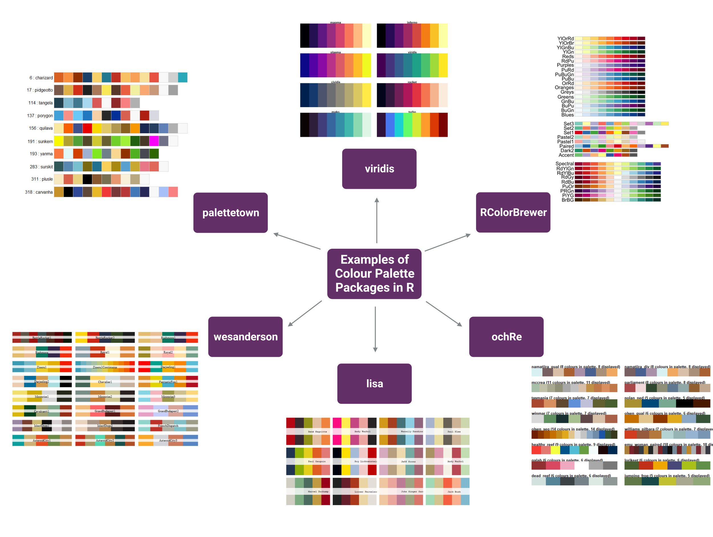
Figure 1 | Examples of colour palette packages available to use in R. Figure made using Biorender.com.
Another option is to create your own palette. You can choose which colours you’d like and amend if necessary. You can find some inspiration here and here. The website Viz Palette is useful for seeing how colours look together. You can combine some of the colour palettes if you have a large dataset.

Figure 2 | Example of a custom colour palettes in R.
3. Labels, titles, and axes
Tailor your graphs to convey the information required. Don’t forget to include units! Use functions like labs() and theme() in ggplot2 to control titles, labels, and other visual elements. These are important for interpreting the data visualisations.
4. Using ggplot2 themes
Embedded themes in ggplot2 can alter the appearance of your plots. Themes such as theme_bw() and theme_minimal() to provide a clean and refined look. Additional customisation through e.g., gghighlight() to draw attention to what you would like the reader to focus on.
5. The final touches
Formatting the final version of the graph can take time. R packages such as cowplot are helpful when combining multiple graphs into one panel. With this package you can create shared labels, titles, legends etc. for graphs in the same figure. You can use ggsave() to adjust the graph e.g., proportions and dpi.

Figure 3 | Example of saving a plot in R. Adjust the dimensions based on what is required.
6. Document your code
Keep a copy of your code so it is easily reproducible and shareable (https://www.staringatr.com/4-formatting-your-code/4_annotations/). R markdown is one way for you to maintain a record. Annotating your code, i.e., adding notes and comments, is also a useful way of keeping a record and will help when you’re searching for something again in the future! Use headers and sections to organise your code in a logical fashion. Knowing what versions of the tools you are using is also important for reproducibility and when writing the methods section in your manuscript.

Figure 4 | Example of organising your code in R. Keep your code in logical order and annotate as you write.
Here is a list of some helpful R microbiome-based packages https://microsud.github.io/Tools-Microbiome-Analysis/index.html
Honourable mention: Biorender.com. Although this is not a part of R, this is a game-changing online resource when creating visual representations of workflows, methods etc. You can even upload your own graphs and incorporate them! You may need an institutional licence to publish your creations but find out more information here. Some alternatives include Biocoins and Mind the Graph.